How I Designed My Website to Stop Designing My Website
I created several iterations of this website—some might say too many. I designed more than a handful in Figma, and I coded about a handful of those. I enjoy designing and coding, and owning a personal website allows me to do both. Problem is, I would rather write stories and make content that more people find useful than an About Me section.
So, I wanted to stop myself from the repeated updates. Here’s how I did that.
The Idea
The main goal of this website is to share my work and let people know how to connect with me. A myriad of solutions can achieve that, but I used my secondary objective—wanting to prevent myself from messing around with the site’s design—to guide the final look and experience.
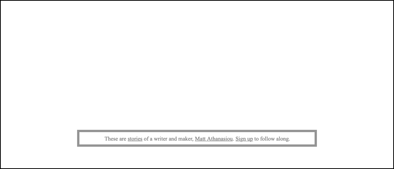
Welcome to Microsoft Word & Standard Novel Manuscript Format meets mattathanasiou.com.


Nearly every element on this site uses a variation of styles from the novel manuscripts I write in Word. I chose this direction to remind myself that I would rather be creating new stories and designs than working on my website, whenever I look at it. It’s working, too. The layout and styles make me think of my current projects, when I visit to start fiddling with elements again.
Here’s a closer look at some of the specific design decisions.
The Layout
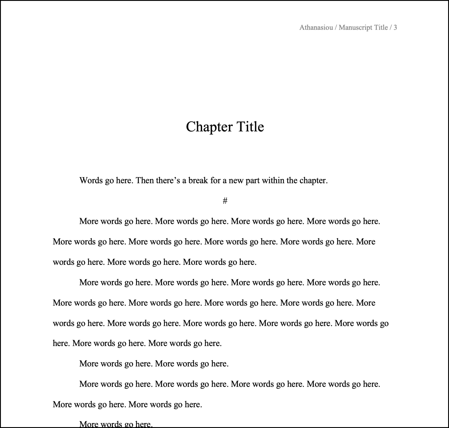
The bulk of the site sits on a single page, like a novel manuscript existing in a single document. This layout makes it important to create sections with easily recognizable beginnings and endings, preventing similarly looking content from running together and confusing readers. A novel manuscript solves this with the order and spacing of information—and, in the case of the format I prefer, with a few different font sizes. More on the latter later.
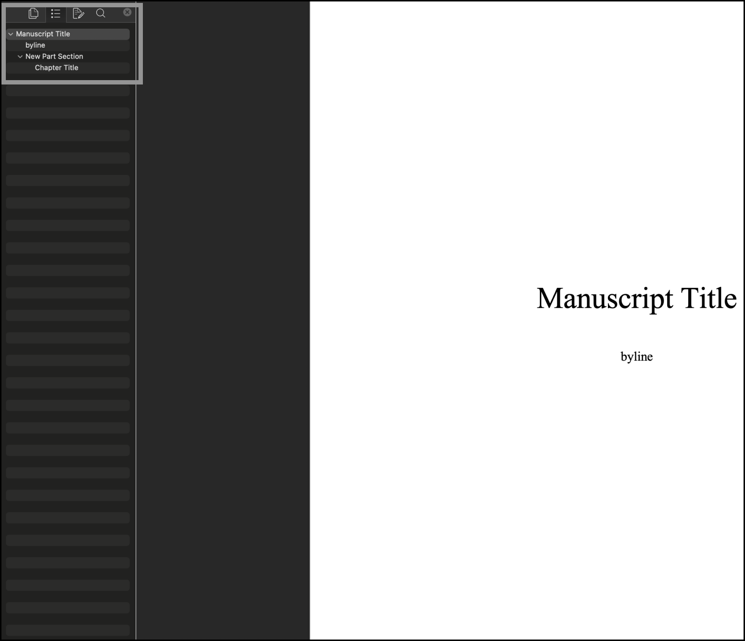
The order and spacing of information in basic manuscripts—even without changing font sizes—creates a recognizable system that signals to readers what type of content they’re seeing. Text centered in the middle of the first page of a document? That’s your Title. Text centered in the middle of the page on a subsequent page? That’s the start of a new Part. Text centered toward the top of the page with left aligned text close beneath it? You’re looking at a new Chapter. And that’s how I laid out the site.
Title of Manuscript = Title of Site—you can see the screenshots above.
Title of New Manuscript Part = New Site Section.

Title of Chapter and Associated Prose = New Content Within a Site Section.

Adopting the manuscript layout for the site creates a natural hierarchy of information and progression, dividing content into easily digestible parts.
On subsequent pages of the site, the styles from “Title of Chapter and Associated Prose = New Content Within a Site Section” are used; they’re treated as additional “Chapters” within a “Part.”

Having a lot of content on a single page can create friction, however. Readers might have to extensively scroll to find the information they want, especially on mobile devices. Most writing programs have solved for this issue, and I recreated a version of that solution: a table of contents (TOC) with anchor links that let people jump from section to section.
The TOC I made sticks to the top of the main page when you scroll. This position allows for the rest of the page content to remain centered and focused. In the Publications section, the longest section on the page with plans to only get longer, I created a second TOC for the same purpose; it attaches to the bottom of the main TOC and slides away when you leave that section.
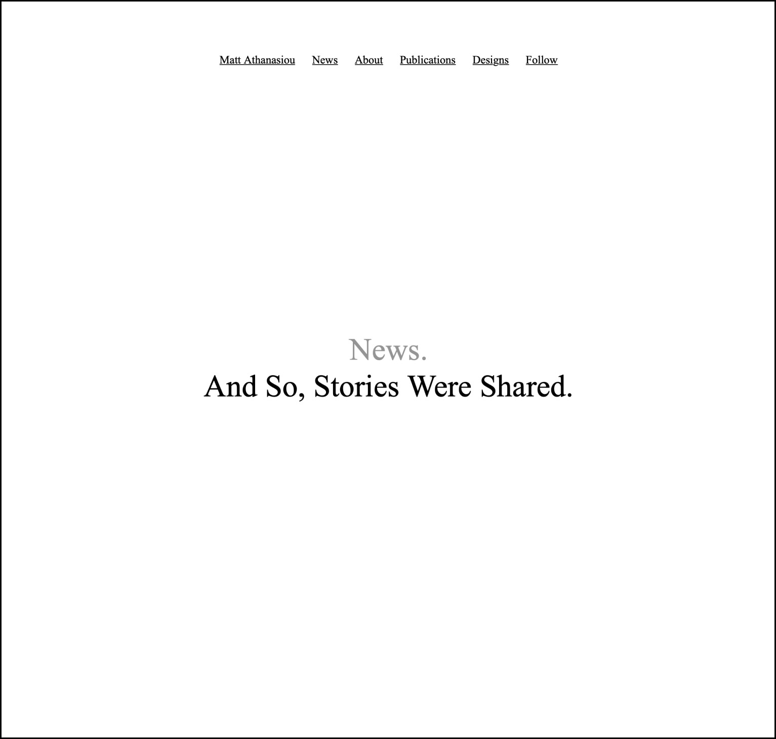
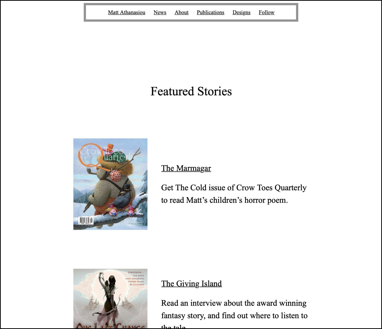
A final note to mention about layout. A few “Chapters” (New Content Within a Site Section) on the main page link to separate pages with additional content. The News section does this for two reasons. One is to create a Featured Stories “Chapter” within it, so I can highlight a short list of specific work on the main page, but also guide people to the more work and updates on my Journal; the second is that the Journal will grow to become the longest “Chapter,” and giving it a dedicated page will prevent the main page from becoming too dense.
For the other “Parts” with “Chapters” on separate pages, the reason behind this decision is inputs—the forms you can fill out. I imagine those inputs will be used sparingly, so keeping them on the main page becomes a distraction, giving people extra actions they’ll rarely take. I would rather the main page focus on creative work that inspires myself and readers.
Font and Color Styles
The font and font sizes match what I use in Word documents, while writing at 180% screen zoom. The font is Times New Roman—what many publishers and agents request for manuscripts—and the font sizes are the following:
Site title = 52px
Part title = 44px
Section (Chapter) title = 36px
Body = 24 px
Caption (header and footer text) = 16px
You can see the Caption font in the header and footer of every page. The gray text—and, in the header, right aligned—mirrors the smaller font that appears on my Word pages to distinguish the author, story title, and page number.

On the site, that content is replaced with links to the main page, Journal, and Sign Up page—the footer repeats those links, but with prose, because I like prose.

The TOC that begins beneath the site title also resembles a byline, so I combined styles from the manuscript byline—the black color, similar spacing—but used the less obtrusive Caption font size like the header, so the TOC doesn’t distract from the main content.

Additional Inspiration
I debated writing about why I include the information in each section, but the explanations felt self-explanatory. Tweet or message me if you think otherwise, and I’ll consider writing a separate post.
However. There is one section on the main page I want to call attention to. You can’t reach it with the sticky TOC. You have to scroll to find it.

The Blank Page section talks about my appreciation for blank pages and links to a blank page. My hope is that anyone who finds themselves scrolling to kill time might discover this “Part,” learn why I think blank pages are inspiring, and get inspired themselves.
The End
There will be updates to the site, maybe adding background images to “Part” sections or something else, but I’m in no rush. Updates would keep me from doing what I’d rather be doing. Making things that are more meaningful and sharing them with others.