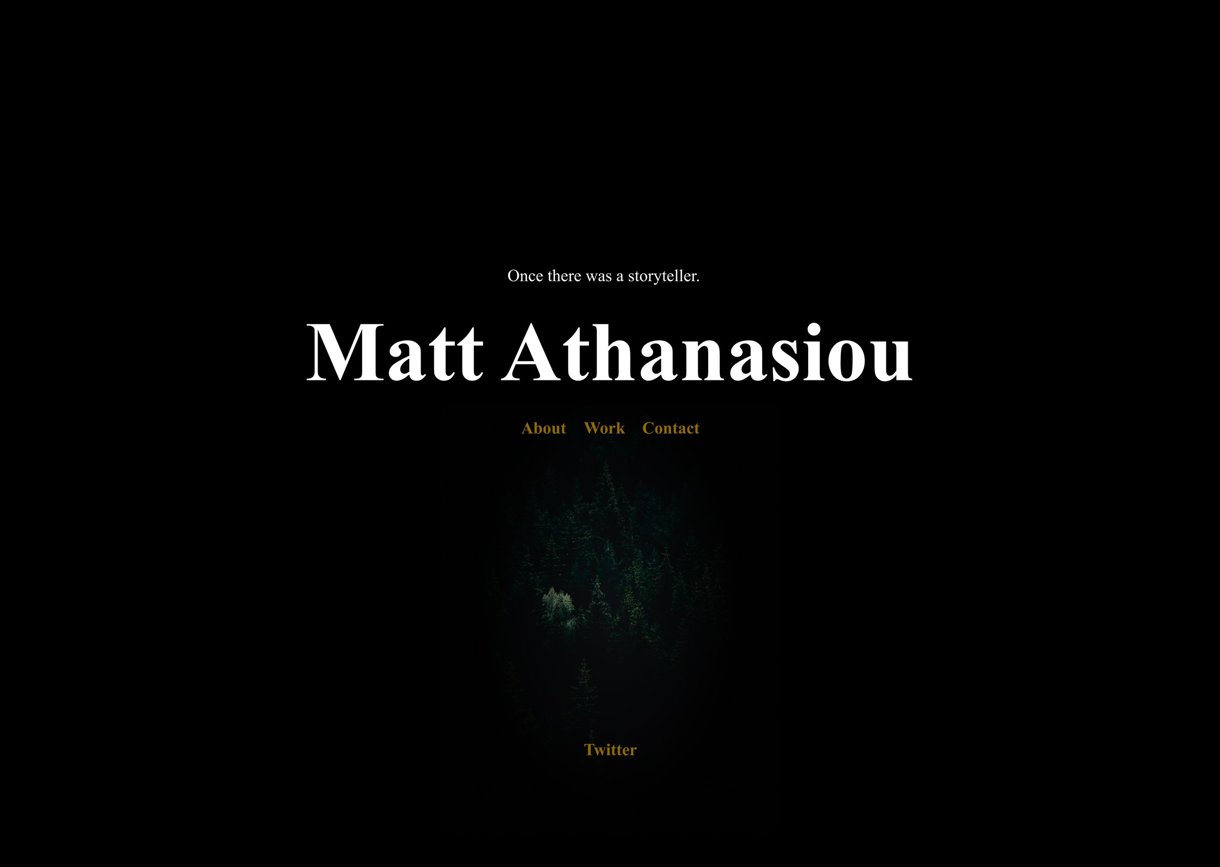
Journal of Many-sized Tales
Another Day for Love (Monsters)
Love ain’t so bad to celebrate.
Another year, another Valentine’s, another monster doodle to remind you there are worse things to celebrate than a day for love. Happy Valentine’s Day.
You can read the original post here if you’d like.
A Day for Love (Monsters)
Love ain’t so bad to celebrate.
Every online journal I’ve had shares a similar post about Valentine’s Day.
About time this one followed suit.
Each year, I hear people say they don’t celebrate Valentine’s. Their reasons are typically one, it was started to sell greeting cards, or two, you shouldn’t need a day to celebrate love.
Here’s another take.
You don’t need to wait for the holidays to give gifts, eat candy, or play dress up, but many of us celebrate holidays where giving gifts, eating candy, and playing dress up are a big part. So why should love be any different?
Show some heart every day, and when Valentine’s comes around, consider showing it again and showing it more. And regardless of how it started (I believe the aforementioned beginning is a myth) or even if it’s become commercialized, you don’t have to spend money to express nice sentiments for another. Do it however feels best to you. Remember, there are worse things to celebrate in the world than a day of love—and it’s even more beautiful to think that millions might be celebrating it at the same time. Imagine what the world might be like, if we celebrated love together a little more often.
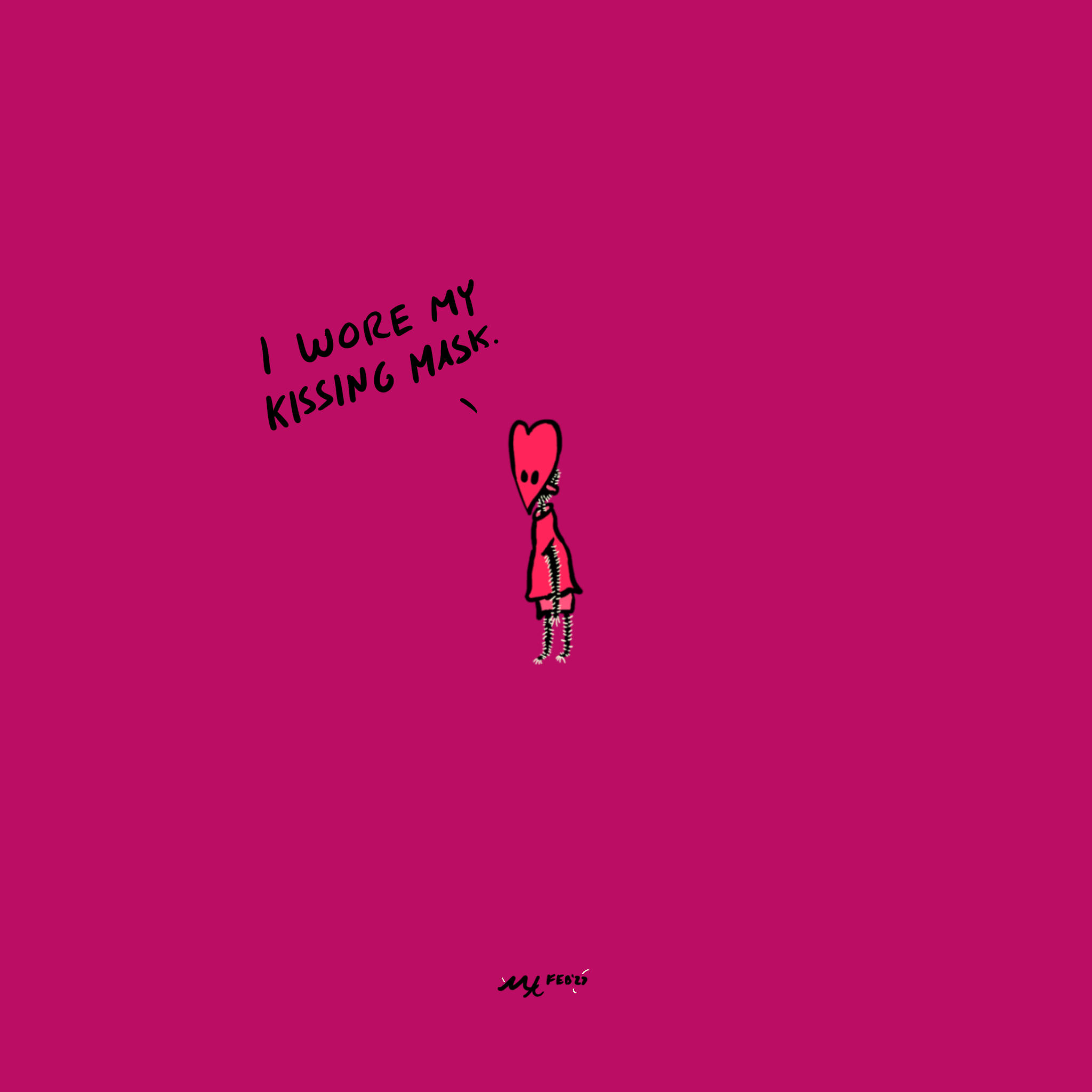
With that, I leave you with a monster doodle of love that cost nothing and was fun to make. We’ll call him Heartmouth, and he hopes you’ll join him in wishing others a Happy Valentine’s.

Monster Doodles
Talking about monsters and doodles.
I’ve been doodling monsters.
I often doodle them to unwind. I’ll either grab a notebook and a pen or my iPad and Procreate and just start drawing. I treat the process like a first draft of writing, focusing on a smidge of an idea and seeing what lands on the page. If I’m using Procreate, I usually start with a pencil tool, then add a layer to go over it with a pen tool. Sometimes I add color, sometimes not, whatever I’m feeling in the moment.
These doodles are brief but wonderful escapes from the day, and I try not to worry about the finished product or making “mistakes.” They’re supposed to be messy and fun and offer a moment to not worry about “mistakes,” but let seemingly errant lines lead where they may.
You’ll likely see some of these doodles wind up on my site, like the guy on the homepage, and you can also see them on Instagram. I’ve reduced how much I use social media—I’ve virtually stopped on X after having to block and report over 100 bot followers, plus no longer being able to make much sense of my feed—but I realized that the little I was using the socials, I was opening Instagram for cats and art. That brought me small moments of joy, so I figured I’d play around there for a bit. The plan right now is to share doodles, book and movie reviews, likely some writing tips and tidbits, and anything else that feels fun. Say hi if you’re around those parts, and feel free to share your own monster doodles!
And with that, I’ll say goodbye with two colored versions of the homepage monster doodle. Find more on the gram (@mattisnotscary).


Here There Be Promises: Writing and Design Goals for Q2 2023
Some creative goals for Q2.
The first quarter has come and gone, seemingly as fast as a cobbler elf in the night. So now we’re here, early April, and it’s time to review what I completed and what’s coming next.
You can learn more about my goals process from the January post. The high level is: I enjoy setting myself goals. They hold me accountable, and I hope sharing them inspires others to create, and even share, theirs.
Below you will find my creative ambitions. I am keeping personal and health goals private for now, but I recommend weaving those into yours as well. Like Jack, all work and no play ain’t good for anyone.
#
First, a quick recap of the first quarter. I wrapped the second draft of my TLS novel manuscript, sent The Superpowers of Love query to an editor, and sort of connected with some writers via Twitter, Discord, and virtual Writing Meetups. Not too shabby.
But. I didn’t meet all of my goals. I failed to send my edited query to new agents. The edits took longer than expected, and I am okay with this. First impressions are important, and that is exactly what a query is. Plus, my original deadline was unrealistic, as I forgot to factor in the editor’s response times. Currently, I am finalizing a few sentences of the summary, and I am extending my deadline, as seen below.
Also, while I posted more about writing on Twitter, I could have done a better job of having deeper conversations on the platform, as well as on Discord and via Writing Meetups.
Lastly, I didn’t complete my stretch goal in design. I sketched and designed a few logos, but my attempts were halfhearted. Instead of forcing myself to finish and send a design I wasn’t proud of, I let go of the project. This I don’t see as a failure. Saying no can be just as important to saying yes to projects. Quitting the design contest allowed me to focus more on what I cared about. The novel manuscript and the query.
#
With that, here are my goals for April, May, and June.
Writing Goals
Write a Journal entry about Central Thematic Argument by April 14.
Send the Superpowers of Love query to agents by April 20.
Finish edits on the query by April 15
Wrap first chapter edits by April 19.
Finish the third draft of the TLS novel manuscript by June 30.
Read and take notes on the second draft of TLS by April 25.
Begin the third draft of TLS by April 26.
Send stories and queries weekly throughout Q2.
Connect with writers on:
Twitter
Discord
Writing Meetups
Design Goals
(Stretch goal) Launch a simple lifestyle brand with a store and one-page website by June 30.
(Stretch goal) Launch the site Newsletter by June 30.
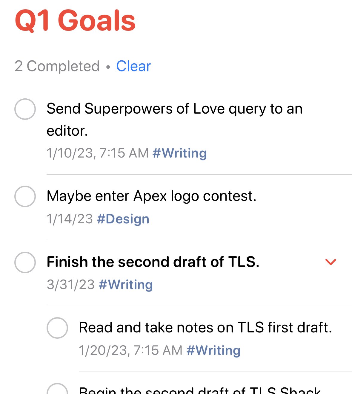
Like Q1, here’s a screenshot of how I use Apple Reminders to track goals.

Drop a comment, tweet, or private message if you have questions, suggestions, or want to share your goals for accountability too.
Happy creating.
January Echoes: Writing and Design Goals for Q1 2023
The start of goals.
I set goals most quarters, and January often sets the tone for the year.
Writing goals can feel like starting a mini-story. I’m the character, I jot down what I want to achieve, and then, like a fun first draft, I set out to see how the story unfolds.
Whether or not I achieve my aims always teaches me something. Sometimes I learn that I’m too ambitious; sometimes I learn that I’m not ambitious enough. Sometimes I learn that I care less about a desire than I thought; sometimes I learn that I care more. Either way, at the end of the quarter, I look at the results, and I use them to plan the next.
In an effort to hold myself more accountable, and to encourage others to do the same, I’m sharing my ambitions for writing and design work—I also set personal goals and health goals, but I’m keeping those private for now. Maybe learning to share more will be one of my goals in Q2.
Writing Goals
Send the Superpowers of Love query to an editor by January 10.
Finish the second draft of the TLS novel manuscript by March 31.
Read and take notes on the first draft of TLS by January 20.
Begin the second draft of TLS on January 21.
Send the Superpowers of Love query to agents by February 1.
Send stories and queries weekly throughout Q1.
Connect with writers on:
Twitter
Discord
Writing Meetups
Design Goals
(Stretch goal) Maybe enter Apex logo contest by January 14.
Here’s a screenshot of how I use Apple Reminders to track goals.
Drop a comment, tweet, or private message if you have questions, suggestions, or want to share your goals for accountability too.
Happy creating.
A Starry—Or Not So Starry—Nonfiction Article
Smashing Magazine published my nonfiction article, Rethinking Star Ratings for Readers. It has pretty pictures designed by me!
It’s been hectic, to say the least. Life in general has been. I’ll add more color to that claim later, but most of my sabbatical goals have been thrown for a loop. Disappointing, but it’s not all bad news around these parts.
The good news is that Smashing Magazine published my nonfiction article, Rethinking Star Ratings for Readers. The piece discusses some of the ways star ratings fail readers, and the write-up offers an alternative solution—with pretty pictures designed by me!—to review literature and better connect people.
The idea struck me a few years ago, and when it wouldn’t leave me alone, I finally decided to get it out of my head onto paper and pixels. I thought I would toss the finished product on this Journal and forget it, but as I wrapped up, I wondered if a publisher might be interested. And someone was. Just goes to show that you never know until you ask.
Big thanks to Smashing Magazine for sharing the piece and helping with edits, and to my friends who gave thoughtful feedback on earlier drafts.

One of the alternative solution designs that you can learn more about in the article.
Links to What I’ve Read About Star Ratings
I’m writing an article about star ratings, and I’ve read a number of pieces for research.
I’m writing an article about star ratings, the ambiguity of them, mainly focused on how they fail readers.
While writing the piece, I’ve read a number of articles for research. Several are linked to in the article, but not all. I’m sharing most of them here for anyone who’s interested in the topic.
#
Links that show people creating their own definitions for star ratings. One and two.
#
An example of star ratings leading to extortion.
#
How you can improve algorithmic recommendations from Goodreads—an algorithm that does not seem to pay attention to the context of your reviews.
#
The 60 most reviewed books on Goodreads from the past five years.
#
The Goodreads mission statement.
#
A hoax xenophobic rating and review.
#
A deep dive into why ambiguous rating scales fail people and companies, specifically looking at NPS scores.
#
Amazon bookstore closures, where they stocked books that were four stars and above.
#
The bot problem on Goodreads creates a trust problem.
#
People do put some trust in algorithms.
#
The Michelin Guide some people credit with starting the star rating fad.
#
Mariana Starke, whom some people credit with inspiring what would become star ratings.
#
The StoryGraph app that promotes rating and reviewing books with more context than star ratings give.
#
A critical look at several UI and UX problems on Goodreads.
#
How positive star ratings can sometimes seem too good to be true.
#
An HBR article about problems with and solutions for the star rating system.
#
Reasons to not care about star ratings.
Site Designs Left by the Wayside
A few mock-ups of site designs I considered.
I wrote in a previous entry that I designed too many versions of this site and wanted to stop. While that entry talks about how I ended up with the current iteration, I saved several of the unused versions. Here are a few mock-ups of those iterations, along with brief notes about my thinking process. You can kill your darlings, but that doesn’t mean you have to forget them forever.
The Altered Photos Version
This is one of the earliest versions I created. I grabbed images from Unsplash that represented published pieces of my work. I edited the pictures to be minimalist and suggestive, and I added text from my stories related to each one. My two main reasons for not using this version are: 1) the feeling the images and text create are inconsistent and chaotic across different pages, and 2) the images and text scale poorly on mobile screens.


The Darkly Colored Altered Photos Version
This concept is similar to the Alter Photos Version, except that I leaned into the original images more. The dark edges and subtle colors create a sense of mystery, and the quotes from my stories give a preview of the type of writing I typically do. The text is no longer a part of the images—unlike the first version—which helps it scale better on smaller screen sizes. I like this concept, but I decided against using it, because I constantly found myself second-guessing which stories to use quotes from and which pictures to use. Additionally, this version felt like it was missing a smidge of playfulness that can also be found in my writing.
The Dark Fairy Tale Version
I love fairy tales, with an even softer spot for the dark ones. While some of my stories can be labeled dark fantasy, this version of the site gives the impression that the genre represents all of my work. I appreciate the consistency of this iteration, but I wanted a more accurate representation of my writing.
The Dark and Playful Version
I enjoy writing children’s literature from time to time. I allow myself to use more lyrical language and fantastical ideas when I write in the genre. In this version of the site, I leaned into playfulness by adding weird doodles and writing each page like it was a book chapter with a summary. Ultimately the site felt like it skewed too heavily toward children’s stories—albeit darker ones.


The Literary Designer Version
I dig this version, how it leans into the text. On the home page, I like the large M/A symbol juxtaposed with the small prose type, and the color distantly reminds me of aged paper. Subsequent pages utilize large stylized prose for headlines, which feels both like chapter titles and summaries of each page’s content. The main reason I didn’t use this iteration was that I became burned out on designing the site, and I wanted to take a step back before choosing a final direction. That was when I thought up the concept for the current site.


Have thoughts on these versions or want to share iterations of your site? Feel free to message or tweet me.
How I Designed My Website to Stop Designing My Website
I created several iterations of this website—some might say too many.
I created several iterations of this website—some might say too many. I designed more than a handful in Figma, and I coded about a handful of those. I enjoy designing and coding, and owning a personal website allows me to do both. Problem is, I would rather write stories and make content that more people find useful than an About Me section.
So, I wanted to stop myself from the repeated updates. Here’s how I did that.
The Idea
The main goal of this website is to share my work and let people know how to connect with me. A myriad of solutions can achieve that, but I used my secondary objective—wanting to prevent myself from messing around with the site’s design—to guide the final look and experience.
Welcome to Microsoft Word & Standard Novel Manuscript Format meets mattathanasiou.com.


Nearly every element on this site uses a variation of styles from the novel manuscripts I write in Word. I chose this direction to remind myself that I would rather be creating new stories and designs than working on my website, whenever I look at it. It’s working, too. The layout and styles make me think of my current projects, when I visit to start fiddling with elements again.
Here’s a closer look at some of the specific design decisions.
The Layout
The bulk of the site sits on a single page, like a novel manuscript existing in a single document. This layout makes it important to create sections with easily recognizable beginnings and endings, preventing similarly looking content from running together and confusing readers. A novel manuscript solves this with the order and spacing of information—and, in the case of the format I prefer, with a few different font sizes. More on the latter later.
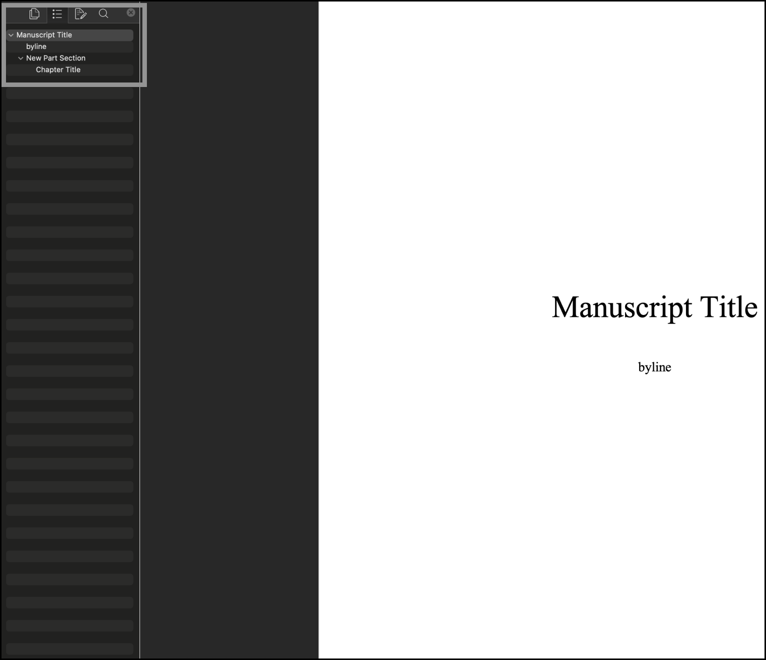
The order and spacing of information in basic manuscripts—even without changing font sizes—creates a recognizable system that signals to readers what type of content they’re seeing. Text centered in the middle of the first page of a document? That’s your Title. Text centered in the middle of the page on a subsequent page? That’s the start of a new Part. Text centered toward the top of the page with left aligned text close beneath it? You’re looking at a new Chapter. And that’s how I laid out the site.
Title of Manuscript = Title of Site—you can see the screenshots above.
Title of New Manuscript Part = New Site Section.

Title of Chapter and Associated Prose = New Content Within a Site Section.
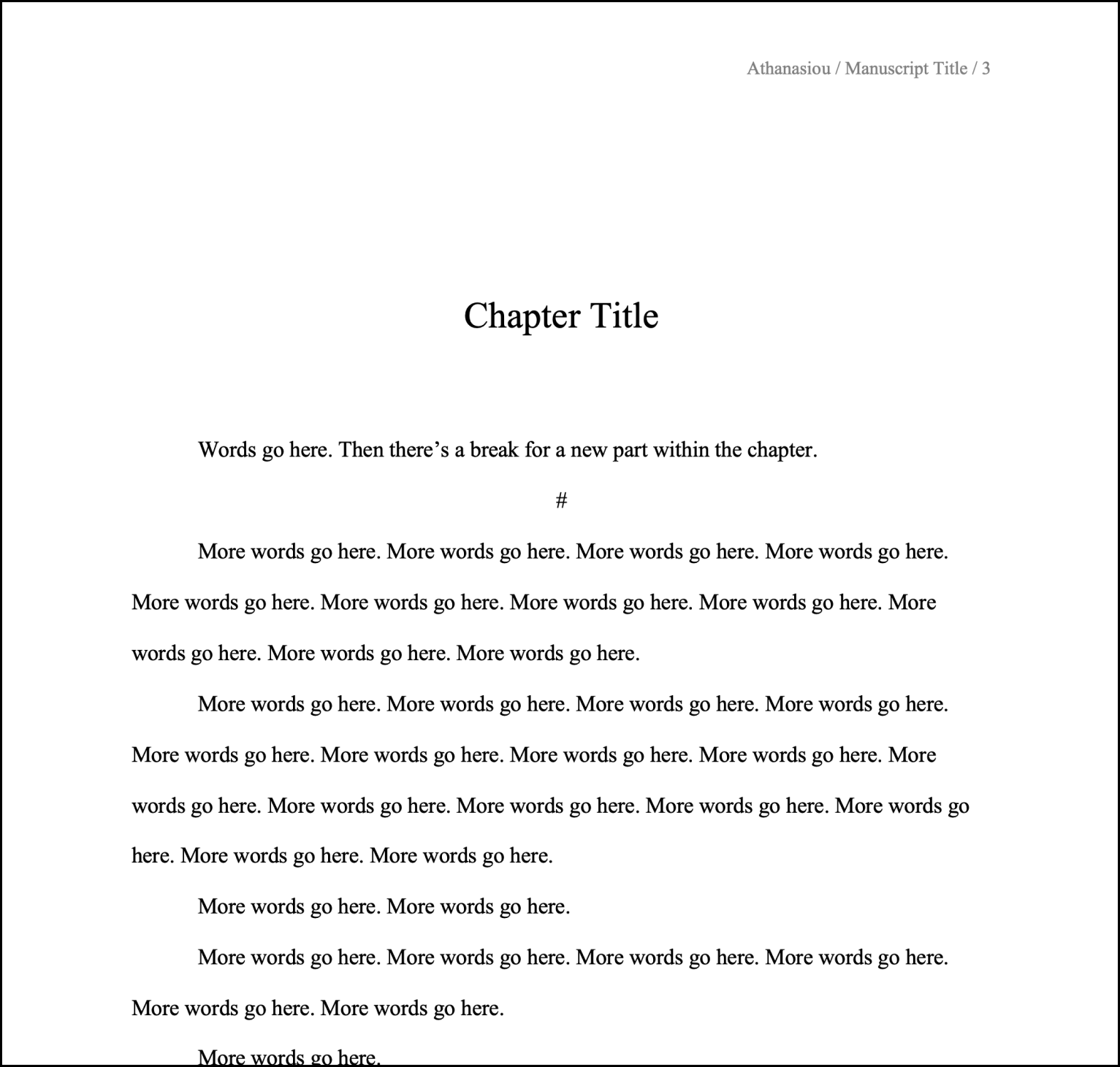

Adopting the manuscript layout for the site creates a natural hierarchy of information and progression, dividing content into easily digestible parts.
On subsequent pages of the site, the styles from “Title of Chapter and Associated Prose = New Content Within a Site Section” are used; they’re treated as additional “Chapters” within a “Part.”

Having a lot of content on a single page can create friction, however. Readers might have to extensively scroll to find the information they want, especially on mobile devices. Most writing programs have solved for this issue, and I recreated a version of that solution: a table of contents (TOC) with anchor links that let people jump from section to section.
The TOC I made sticks to the top of the main page when you scroll. This position allows for the rest of the page content to remain centered and focused. In the Publications section, the longest section on the page with plans to only get longer, I created a second TOC for the same purpose; it attaches to the bottom of the main TOC and slides away when you leave that section.
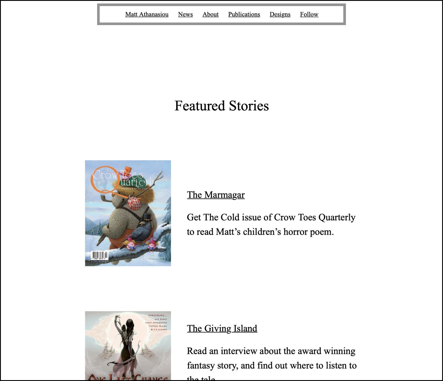
A final note to mention about layout. A few “Chapters” (New Content Within a Site Section) on the main page link to separate pages with additional content. The News section does this for two reasons. One is to create a Featured Stories “Chapter” within it, so I can highlight a short list of specific work on the main page, but also guide people to the more work and updates on my Journal; the second is that the Journal will grow to become the longest “Chapter,” and giving it a dedicated page will prevent the main page from becoming too dense.
For the other “Parts” with “Chapters” on separate pages, the reason behind this decision is inputs—the forms you can fill out. I imagine those inputs will be used sparingly, so keeping them on the main page becomes a distraction, giving people extra actions they’ll rarely take. I would rather the main page focus on creative work that inspires myself and readers.
Font and Color Styles
The font and font sizes match what I use in Word documents, while writing at 180% screen zoom. The font is Times New Roman—what many publishers and agents request for manuscripts—and the font sizes are the following:
Site title = 52px
Part title = 44px
Section (Chapter) title = 36px
Body = 24 px
Caption (header and footer text) = 16px
You can see the Caption font in the header and footer of every page. The gray text—and, in the header, right aligned—mirrors the smaller font that appears on my Word pages to distinguish the author, story title, and page number.

On the site, that content is replaced with links to the main page, Journal, and Sign Up page—the footer repeats those links, but with prose, because I like prose.

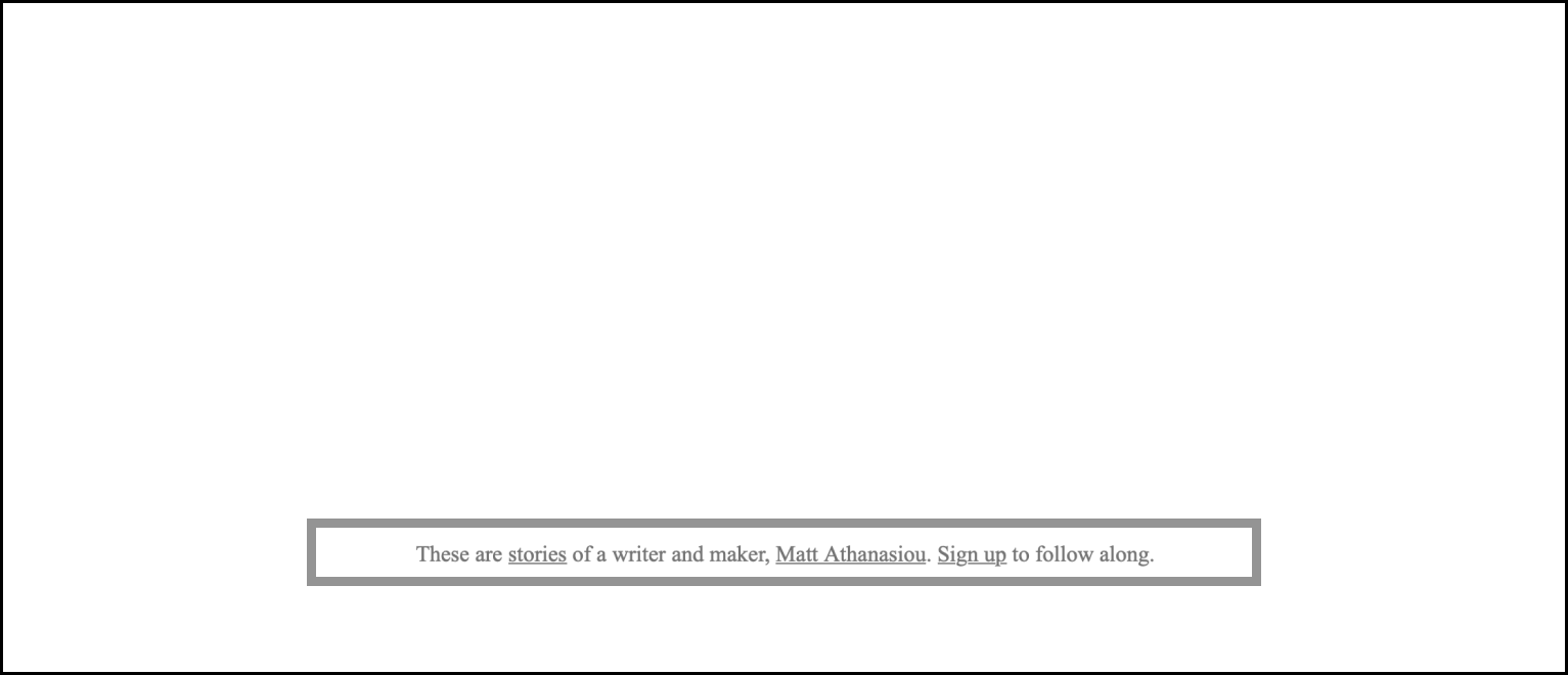
The TOC that begins beneath the site title also resembles a byline, so I combined styles from the manuscript byline—the black color, similar spacing—but used the less obtrusive Caption font size like the header, so the TOC doesn’t distract from the main content.

Additional Inspiration
I debated writing about why I include the information in each section, but the explanations felt self-explanatory. Tweet or message me if you think otherwise, and I’ll consider writing a separate post.
However. There is one section on the main page I want to call attention to. You can’t reach it with the sticky TOC. You have to scroll to find it.

The Blank Page section talks about my appreciation for blank pages and links to a blank page. My hope is that anyone who finds themselves scrolling to kill time might discover this “Part,” learn why I think blank pages are inspiring, and get inspired themselves.
The End
There will be updates to the site, maybe adding background images to “Part” sections or something else, but I’m in no rush. Updates would keep me from doing what I’d rather be doing. Making things that are more meaningful and sharing them with others.