Journal of Many-sized Tales
A Final Date with Tommy Shelby
I remember our first date.

Image from Wikimedia Commons.
I remember our first date. I started watching Peaky Blinders because, in addition to the dark, atmospheric setting, the opening credits uses the song Red Right Hand by my favorite band, Nick Cave & The Bad Seeds. I watched until the third episode before I stopped. Something about Thomas and the gang was not resonating.
Years later, after recommendations from several people, I gave the show another go. I overlooked our rocky start, and by the end of the first season, I was hooked. I spent the next handful of seasons watching an antihero commit exceedingly unredeemable acts. By the beginning of the final season, he seemed like the devil that many characters referred to him as.
Without tipping my newsboy hat to spoilers, Thomas performs a number of horrible deeds that could make viewers lose interest in ever rooting for him again. It’s the show’s phenomenal writing that saves him, becoming a magnificent study in how to create and maintain a compelling antihero. Despite all of Thomas’s evil actions, characters more ruthless than him always rise to stand in his way. His only means of overcoming them—of protecting the family and livelihood he gained from his successes—is to become something stronger and meaner and worse. This is the show’s cycle, how it constantly raises the stakes to make viewers understand Thomas’s actions, regardless of if they agree with him. The final season hits a tipping point, and you wonder if Thomas has become that unredeemable devil, or if there is hope for change.
Despite their moralistic flaws, I’m glad I gave Tommy and the Peaky Blinders another chance. I enjoyed our relationship, and we ended on good terms. I’ll miss them.
Site Designs Left by the Wayside
A few mock-ups of site designs I considered.
I wrote in a previous entry that I designed too many versions of this site and wanted to stop. While that entry talks about how I ended up with the current iteration, I saved several of the unused versions. Here are a few mock-ups of those iterations, along with brief notes about my thinking process. You can kill your darlings, but that doesn’t mean you have to forget them forever.
The Altered Photos Version
This is one of the earliest versions I created. I grabbed images from Unsplash that represented published pieces of my work. I edited the pictures to be minimalist and suggestive, and I added text from my stories related to each one. My two main reasons for not using this version are: 1) the feeling the images and text create are inconsistent and chaotic across different pages, and 2) the images and text scale poorly on mobile screens.


The Darkly Colored Altered Photos Version
This concept is similar to the Alter Photos Version, except that I leaned into the original images more. The dark edges and subtle colors create a sense of mystery, and the quotes from my stories give a preview of the type of writing I typically do. The text is no longer a part of the images—unlike the first version—which helps it scale better on smaller screen sizes. I like this concept, but I decided against using it, because I constantly found myself second-guessing which stories to use quotes from and which pictures to use. Additionally, this version felt like it was missing a smidge of playfulness that can also be found in my writing.
The Dark Fairy Tale Version
I love fairy tales, with an even softer spot for the dark ones. While some of my stories can be labeled dark fantasy, this version of the site gives the impression that the genre represents all of my work. I appreciate the consistency of this iteration, but I wanted a more accurate representation of my writing.
The Dark and Playful Version
I enjoy writing children’s literature from time to time. I allow myself to use more lyrical language and fantastical ideas when I write in the genre. In this version of the site, I leaned into playfulness by adding weird doodles and writing each page like it was a book chapter with a summary. Ultimately the site felt like it skewed too heavily toward children’s stories—albeit darker ones.


The Literary Designer Version
I dig this version, how it leans into the text. On the home page, I like the large M/A symbol juxtaposed with the small prose type, and the color distantly reminds me of aged paper. Subsequent pages utilize large stylized prose for headlines, which feels both like chapter titles and summaries of each page’s content. The main reason I didn’t use this iteration was that I became burned out on designing the site, and I wanted to take a step back before choosing a final direction. That was when I thought up the concept for the current site.


Have thoughts on these versions or want to share iterations of your site? Feel free to message or tweet me.
How I Designed My Website to Stop Designing My Website
I created several iterations of this website—some might say too many.
I created several iterations of this website—some might say too many. I designed more than a handful in Figma, and I coded about a handful of those. I enjoy designing and coding, and owning a personal website allows me to do both. Problem is, I would rather write stories and make content that more people find useful than an About Me section.
So, I wanted to stop myself from the repeated updates. Here’s how I did that.
The Idea
The main goal of this website is to share my work and let people know how to connect with me. A myriad of solutions can achieve that, but I used my secondary objective—wanting to prevent myself from messing around with the site’s design—to guide the final look and experience.
Welcome to Microsoft Word & Standard Novel Manuscript Format meets mattathanasiou.com.


Nearly every element on this site uses a variation of styles from the novel manuscripts I write in Word. I chose this direction to remind myself that I would rather be creating new stories and designs than working on my website, whenever I look at it. It’s working, too. The layout and styles make me think of my current projects, when I visit to start fiddling with elements again.
Here’s a closer look at some of the specific design decisions.
The Layout
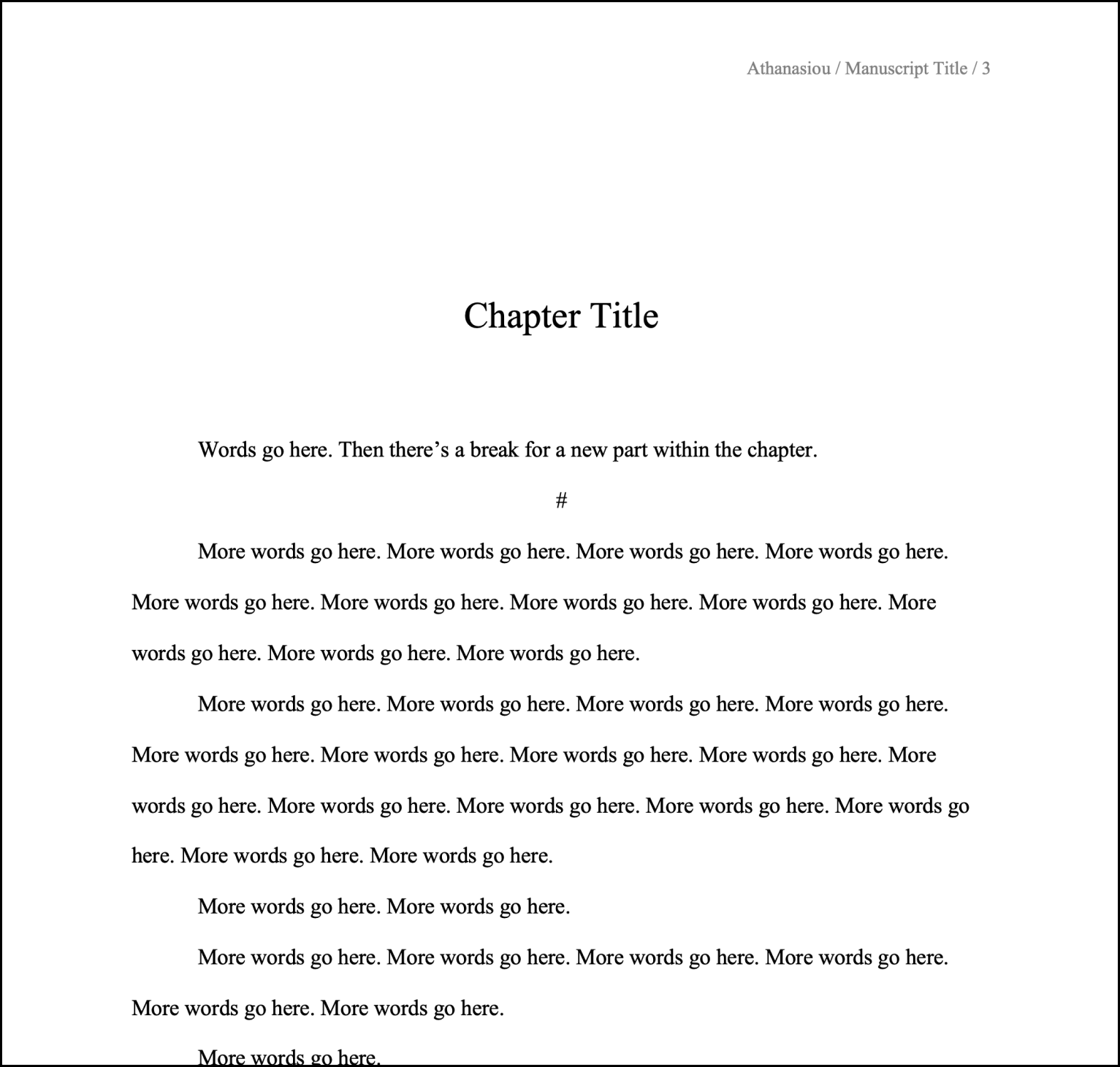
The bulk of the site sits on a single page, like a novel manuscript existing in a single document. This layout makes it important to create sections with easily recognizable beginnings and endings, preventing similarly looking content from running together and confusing readers. A novel manuscript solves this with the order and spacing of information—and, in the case of the format I prefer, with a few different font sizes. More on the latter later.
The order and spacing of information in basic manuscripts—even without changing font sizes—creates a recognizable system that signals to readers what type of content they’re seeing. Text centered in the middle of the first page of a document? That’s your Title. Text centered in the middle of the page on a subsequent page? That’s the start of a new Part. Text centered toward the top of the page with left aligned text close beneath it? You’re looking at a new Chapter. And that’s how I laid out the site.
Title of Manuscript = Title of Site—you can see the screenshots above.
Title of New Manuscript Part = New Site Section.

Title of Chapter and Associated Prose = New Content Within a Site Section.

Adopting the manuscript layout for the site creates a natural hierarchy of information and progression, dividing content into easily digestible parts.
On subsequent pages of the site, the styles from “Title of Chapter and Associated Prose = New Content Within a Site Section” are used; they’re treated as additional “Chapters” within a “Part.”

Having a lot of content on a single page can create friction, however. Readers might have to extensively scroll to find the information they want, especially on mobile devices. Most writing programs have solved for this issue, and I recreated a version of that solution: a table of contents (TOC) with anchor links that let people jump from section to section.
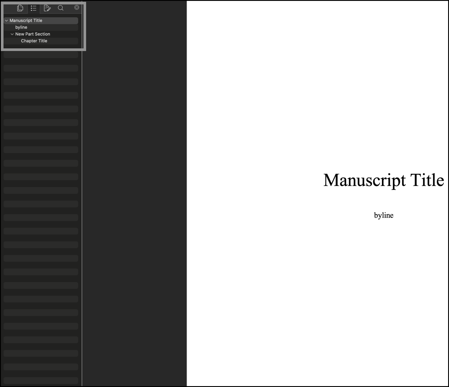
The TOC I made sticks to the top of the main page when you scroll. This position allows for the rest of the page content to remain centered and focused. In the Publications section, the longest section on the page with plans to only get longer, I created a second TOC for the same purpose; it attaches to the bottom of the main TOC and slides away when you leave that section.
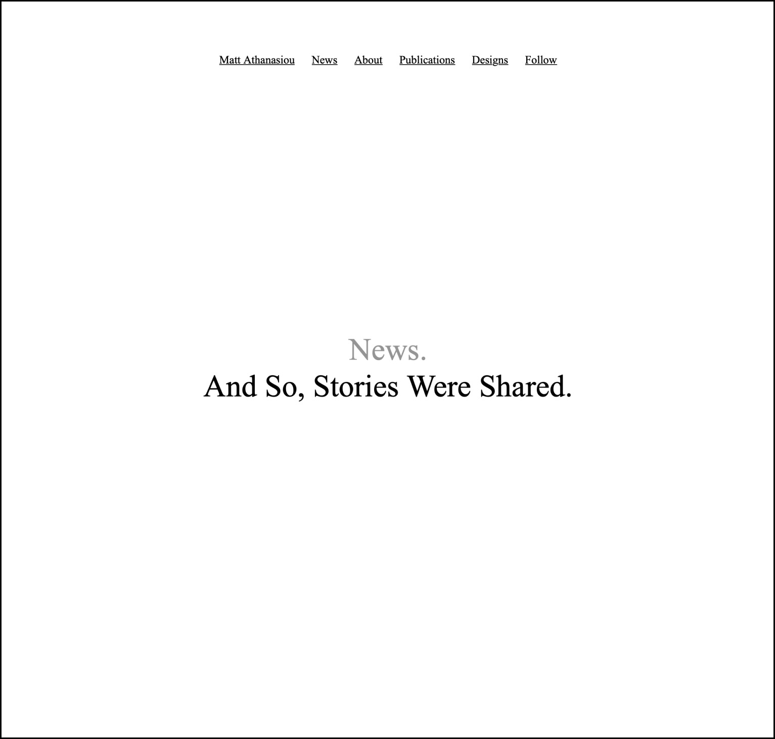
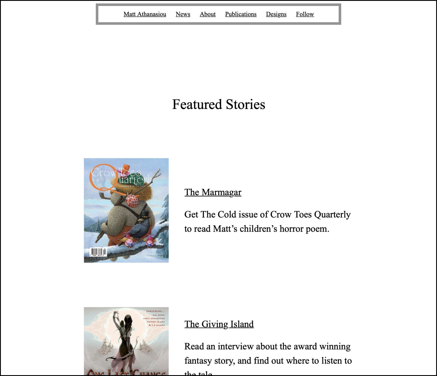
A final note to mention about layout. A few “Chapters” (New Content Within a Site Section) on the main page link to separate pages with additional content. The News section does this for two reasons. One is to create a Featured Stories “Chapter” within it, so I can highlight a short list of specific work on the main page, but also guide people to the more work and updates on my Journal; the second is that the Journal will grow to become the longest “Chapter,” and giving it a dedicated page will prevent the main page from becoming too dense.
For the other “Parts” with “Chapters” on separate pages, the reason behind this decision is inputs—the forms you can fill out. I imagine those inputs will be used sparingly, so keeping them on the main page becomes a distraction, giving people extra actions they’ll rarely take. I would rather the main page focus on creative work that inspires myself and readers.
Font and Color Styles
The font and font sizes match what I use in Word documents, while writing at 180% screen zoom. The font is Times New Roman—what many publishers and agents request for manuscripts—and the font sizes are the following:
Site title = 52px
Part title = 44px
Section (Chapter) title = 36px
Body = 24 px
Caption (header and footer text) = 16px
You can see the Caption font in the header and footer of every page. The gray text—and, in the header, right aligned—mirrors the smaller font that appears on my Word pages to distinguish the author, story title, and page number.

On the site, that content is replaced with links to the main page, Journal, and Sign Up page—the footer repeats those links, but with prose, because I like prose.

The TOC that begins beneath the site title also resembles a byline, so I combined styles from the manuscript byline—the black color, similar spacing—but used the less obtrusive Caption font size like the header, so the TOC doesn’t distract from the main content.

Additional Inspiration
I debated writing about why I include the information in each section, but the explanations felt self-explanatory. Tweet or message me if you think otherwise, and I’ll consider writing a separate post.
However. There is one section on the main page I want to call attention to. You can’t reach it with the sticky TOC. You have to scroll to find it.

The Blank Page section talks about my appreciation for blank pages and links to a blank page. My hope is that anyone who finds themselves scrolling to kill time might discover this “Part,” learn why I think blank pages are inspiring, and get inspired themselves.
The End
There will be updates to the site, maybe adding background images to “Part” sections or something else, but I’m in no rush. Updates would keep me from doing what I’d rather be doing. Making things that are more meaningful and sharing them with others.
Learnings from the Writing App Giveaway
Learn from the doings, and not doings, of my first attempt.
This post is for anyone interested in hosting a social media giveaway. Learn from the doings, and not doings, of my first attempt.
What I Did
I ran a Writing App Giveaway in June.
The prize was a one-year subscription for my favorite writing program, Ulysses. I had won the subscription when my short story, Sparks, was selected as a winner in Ulysses’s contest for Disney’s Flora & Ulysses. Since I’m already subscribed to the program, I decided to host a drawing for the subscription voucher with a few goals in mind.
The barrier to enter the drawing was easy. Follow me on Twitter and retweet the giveaway tweet.
My Goals
I wanted to
build my social media presence.
meet a few people whom I could have continued writing and tech conversations with.
improve the impressions of my non-contest tweets.
get at least one email sign up on my website.
The Outcome
I wanted to
build my social media presence, and I gained about 30 followers, most of them entrants but not all.
meet a few people whom I could have continued writing and tech conversations with, and I have tweeted with some of the new followers, but the conversations are sporadic.
improve the impressions of my non-contest tweets, and impressions rose by about 50% afterward, improving from 50–100 impressions for a typical tweet to 100–200 or higher.
get at least one email sign up on my website, but I got zilch.
It’s also good to note that a few weeks after announcing the winner, some followers dropped, but many stuck around.
What I Learned
The good.
The giveaway was a quick way to gain nearly three dozen followers.
The literal cost of the new, engaged followers feels low, maybe even priceless, as I continue to search for communities and find my voice on Twitter.
If you’re curious about actual numbers, an annual Ulysses subscription is $50—with 30 new followers, that means each one cost around $1.33.
Also, since I had a free voucher for a subscription, this really only cost me time.
I was able to give someone a wonderful writing program subscription.
Because the giveaway promoted Ulysses’s contest and app, the company engaged with some of my tweets, and they were easy to work with when the winner ran into a snag redeeming the voucher.
Where there’s room for improvement.
A handful of entrants seemed to be bots. When I looked at their timelines, I saw that all of them had pinned a tweet resembling an authentic, personal post. The rest of their posts, however, were retweets of giveaways that they were entering. Hundreds of retweets. Oddly, inspecting their profiles further revealed that a number of them listed Michigan as their location—what’s going on in the Wolverine state? I doubt these followers will be engaging with me and supporting much of my work.
One way to avoid most bots would be to make entry harder. Consider running a caption contest or having people write a story in a tweet, and then choose your favorite. You might get fewer entrants, but the quality of engagement and followers will likely be better.
The winner experienced an issue with the voucher. The redemption failed. I was confident my Ulysses contact would get me a working code, but they were out of office, so it took about two weeks to get the issue resolved. Additionally, I made this problem more difficult for myself by telling the winner that I would wait until they had the prize, before I announced them. This not only required me to stay in regular contact with the winner—whom I, a stranger to them, understandably had to reassure would receive their prize—but also with followers to update when I would announce the winner.
Tell the winner that you will announce them, as soon as they acknowledge being the winner. Then you will only have to give them regular updates, rather than all of your followers too.
If you want email sign ups, make that the entry requirement.
Would I Host Another Giveaway?
I think so, but I’d probably experiment with another format. I like the idea of making entry a creative writing prompt. I imagine more people would interact with each other, and we might build more meaningful connections. Plus, trying something different just sounds fun.